Pre-documented responsive Figma components.
All pixel-perfect Figma components of the Afterlife Design System. Created with variables, auto-layout, component variants, and properties. Waiting for you to be coded.
Accordions
Interactive titles that reveal a section of content.
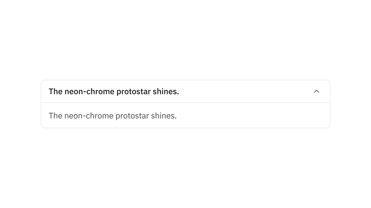
Collection of 9 components.
Aspect Ratio
Fixed aspect ratio component made from fixed-positioned overlays and auto-layouts.
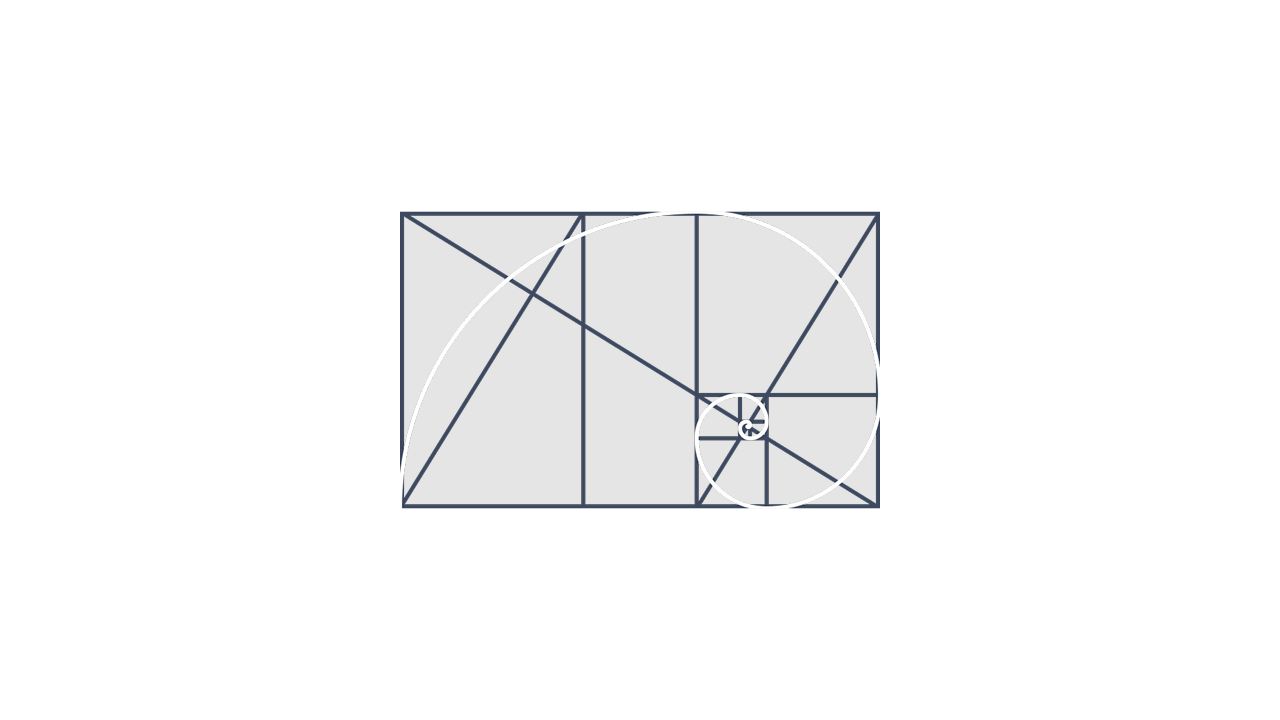
Collection of 1 components.
Avatars
Visually represent users, teams or brands.
Collection of 3 components.
Badges
Short attention-grabbing labels.

Collection of 3 components.
Banners
Announcement strips for important messages.
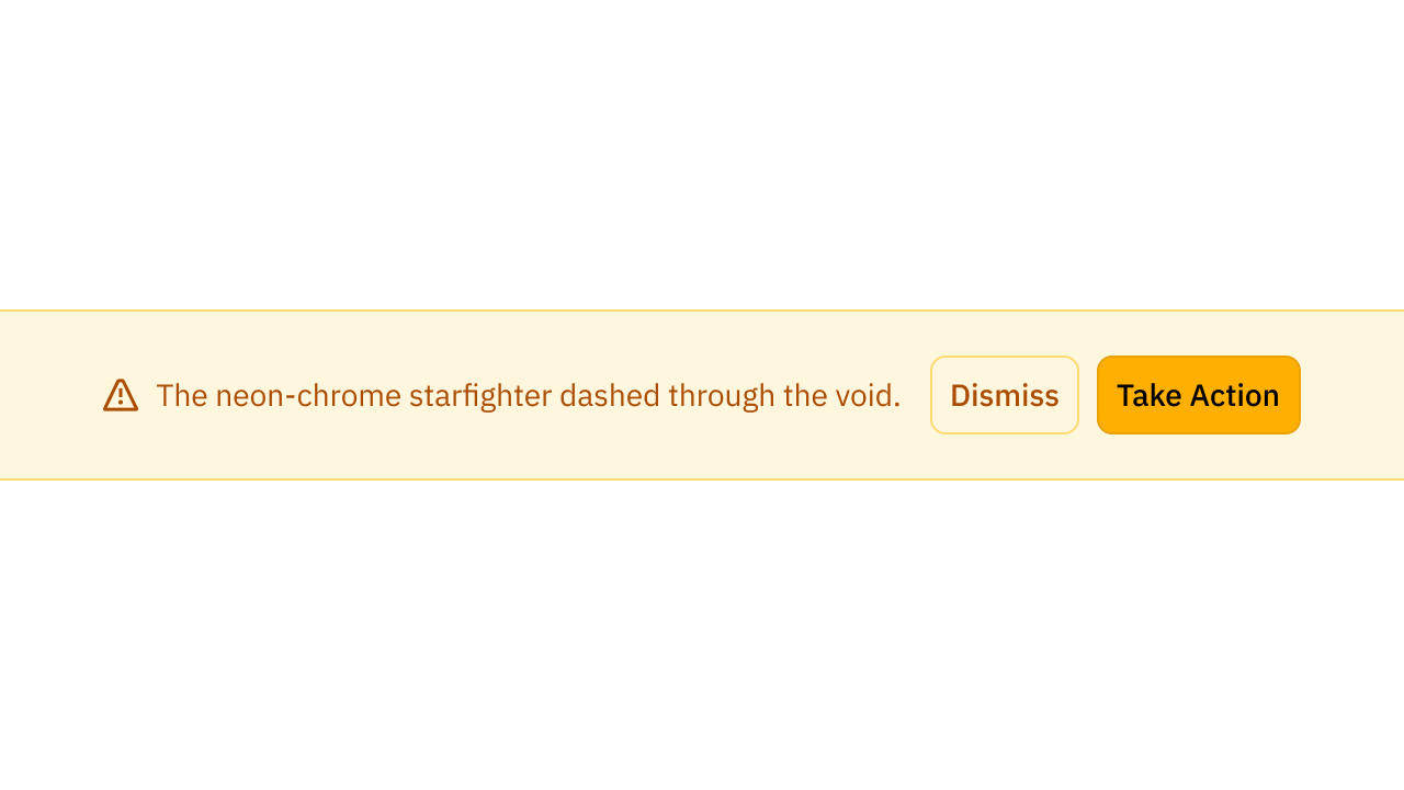
Collection of 2 components.
Breadcrumbs
Set of links ordered hierarchically.
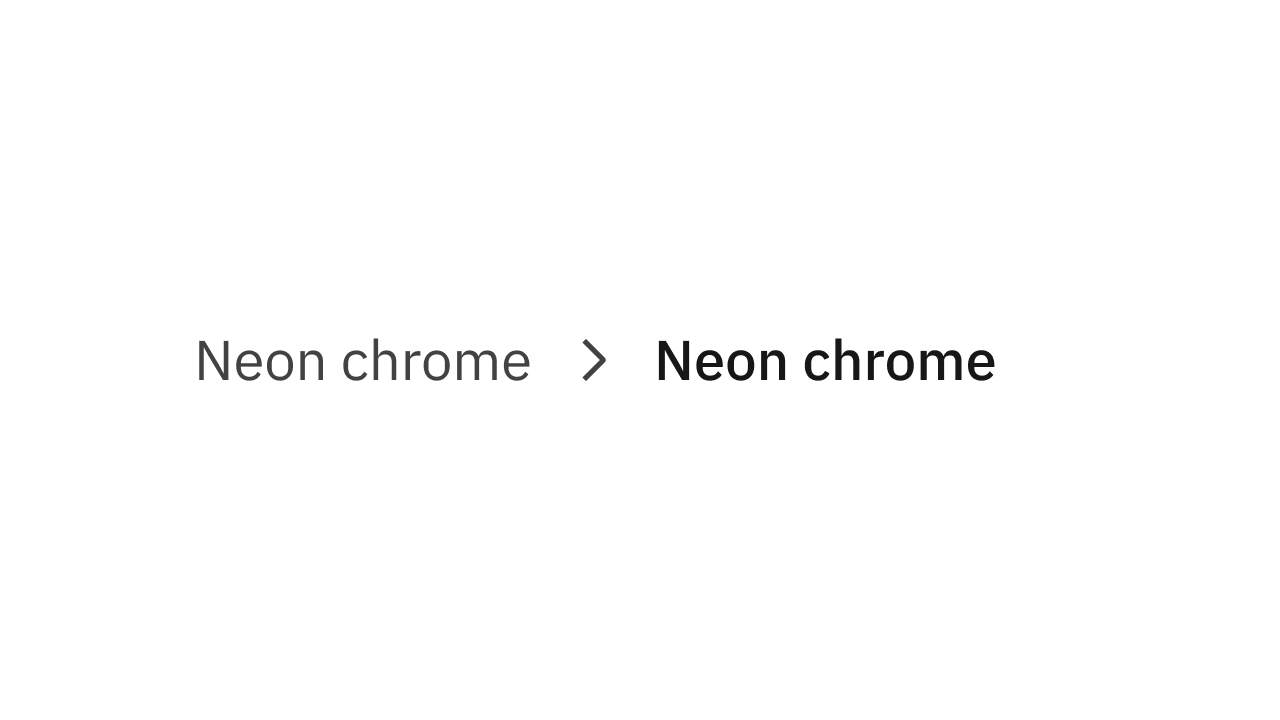
Collection of 5 components.
Buttons
Triggers an action or an event.
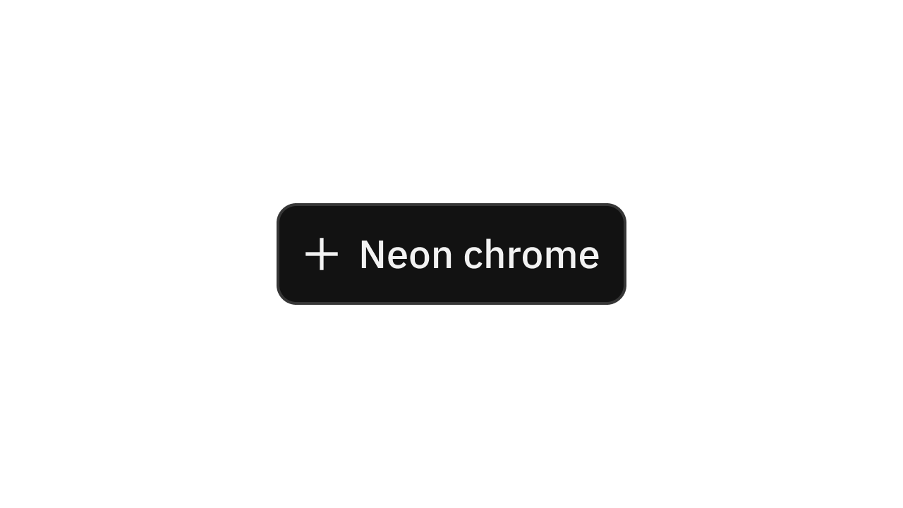
Collection of 2 components.
Calendar
Allows users to enter and edit dates.
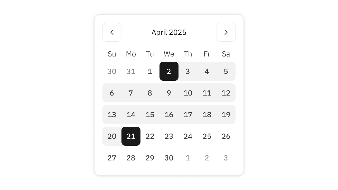
Collection of 3 components.
Cards
A container for content representing a single entity.
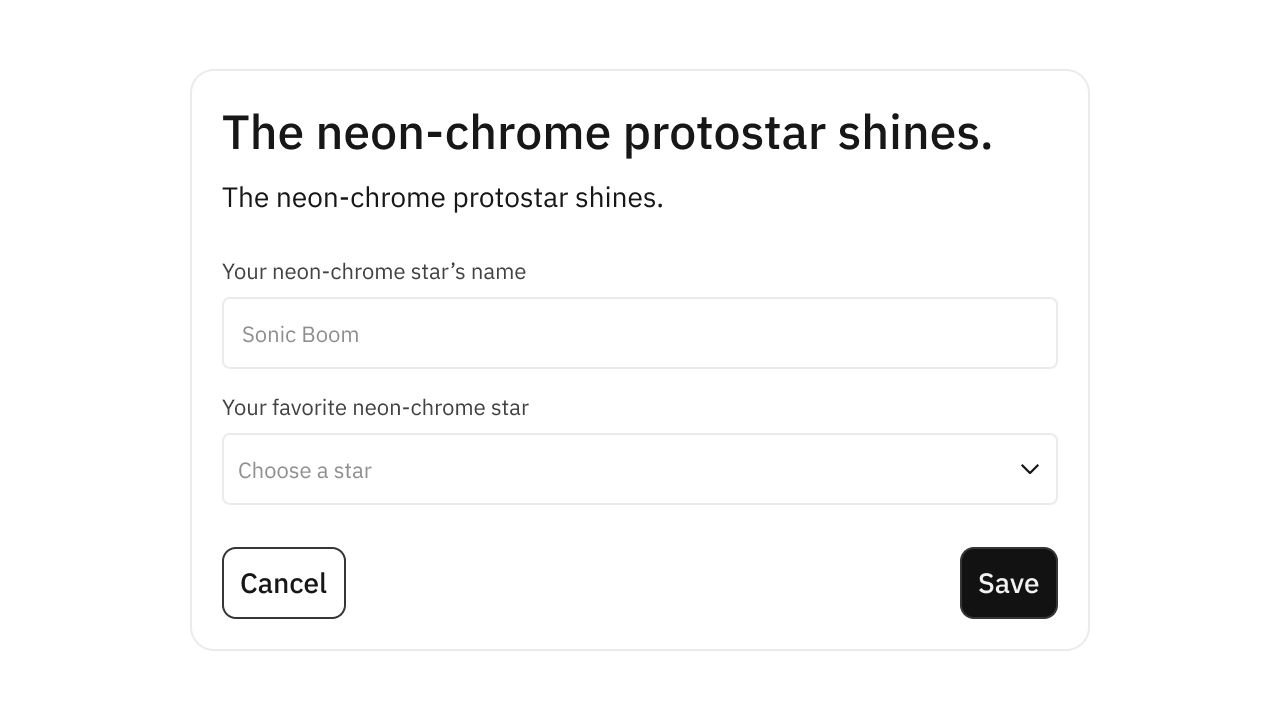
Collection of 4 components.
Carousel
Cycles through elements.
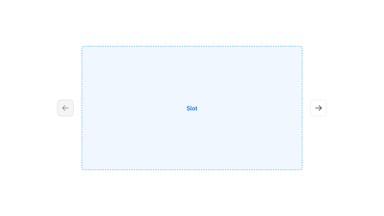
Collection of 3 components.
Charts
Visualize data on an orthogonal coordinate system.
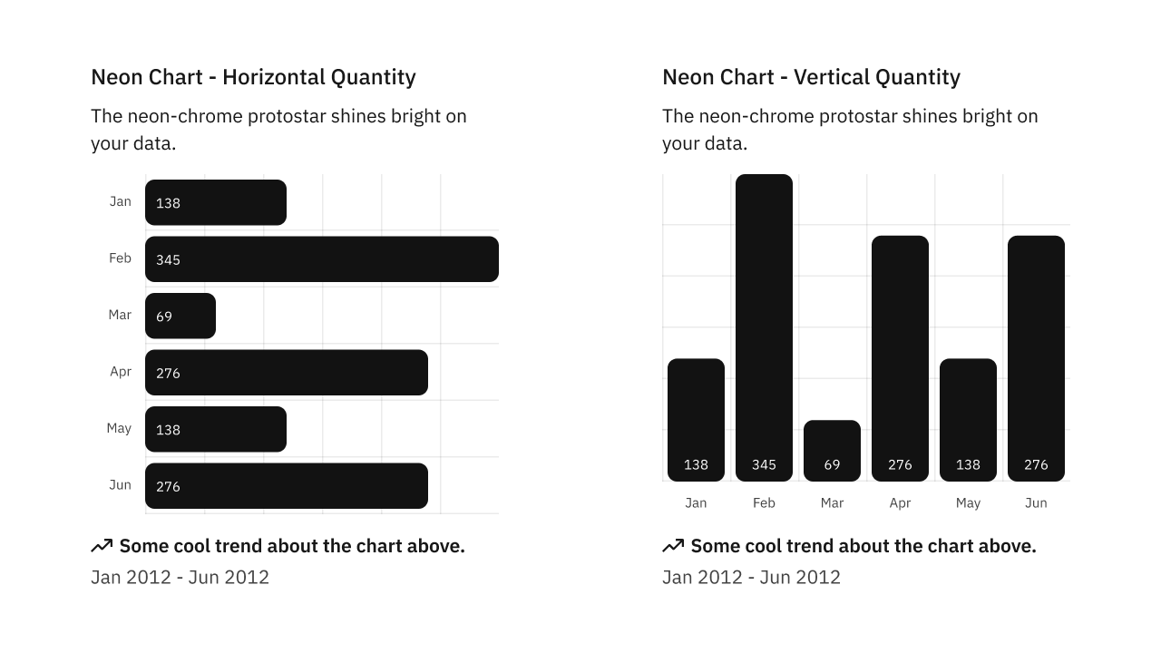
Collection of 15 components.
Chatbot
Chatbot launcher button.

Collection of 1 components.
Code Fragments
Display a snippet of copyable code.
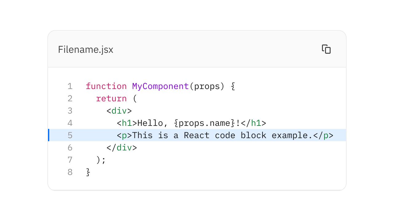
Collection of 5 components.
Command
Fast and composable command menu dialog.
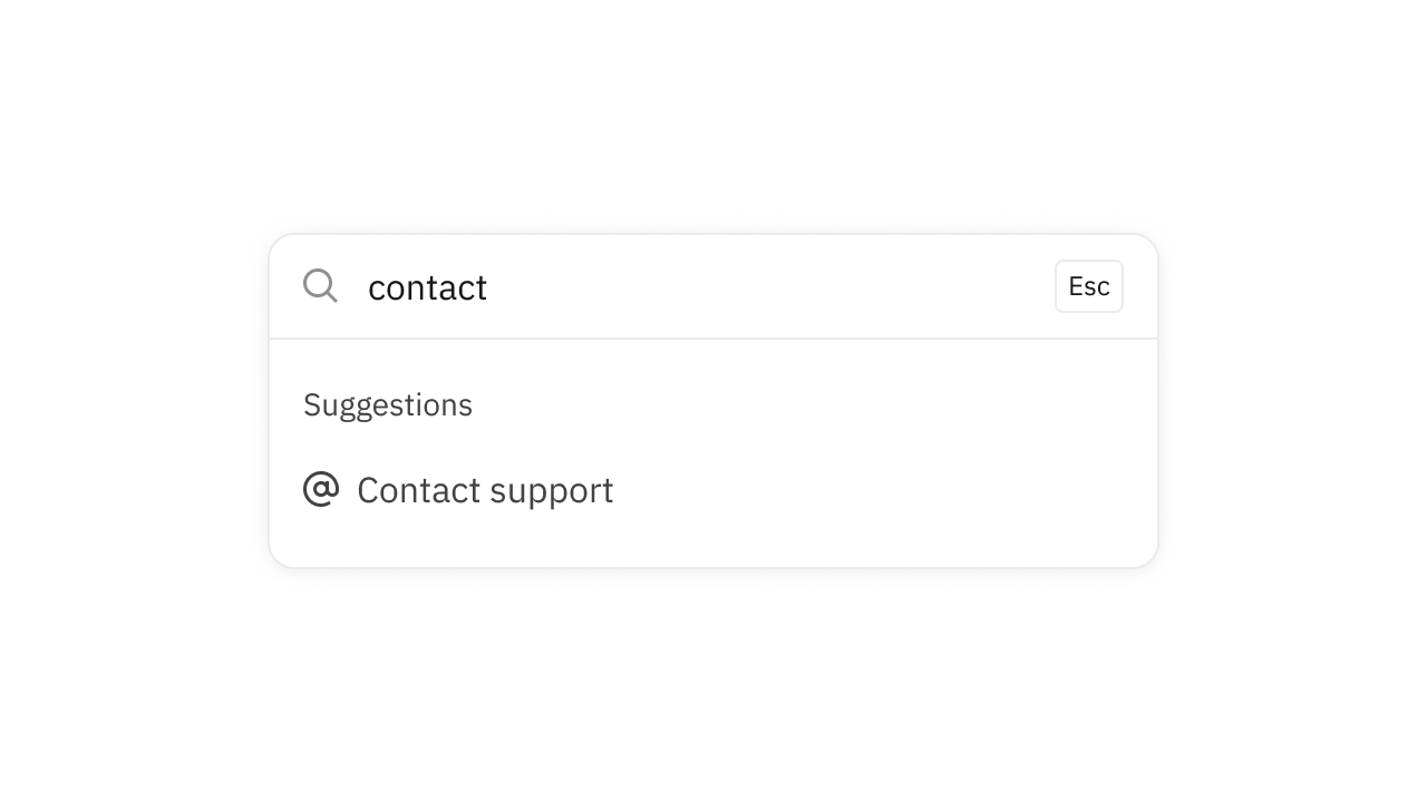
Collection of 7 components.
Corner Dots
Position small dots above components.
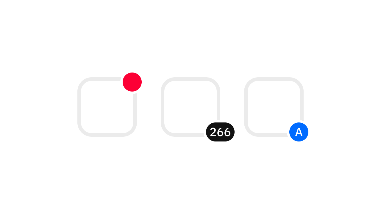
Collection of 1 components.
Date Picker
Date selection with trigger and popover.
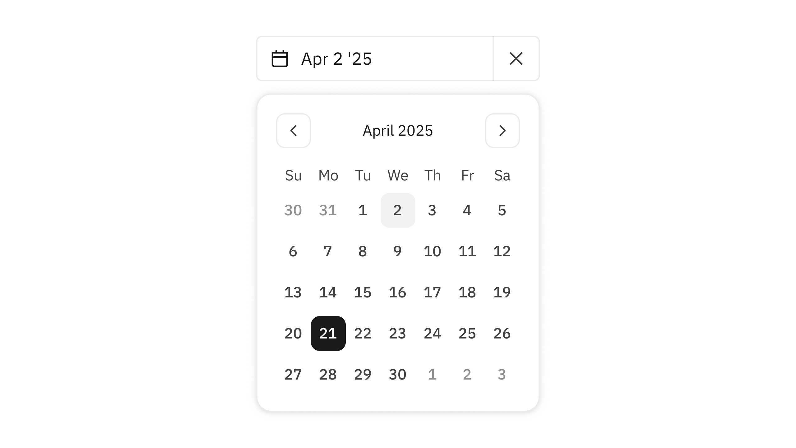
Collection of 3 components.
Dividers
Visual distinction between sections.

Collection of 1 components.
Dots
Small attention-grabbing indicators.
Collection of 3 components.
Draggable
Enables a user to reorder labels in a set.
Collection of 1 components.
Drawer
Separate view from the existing context.
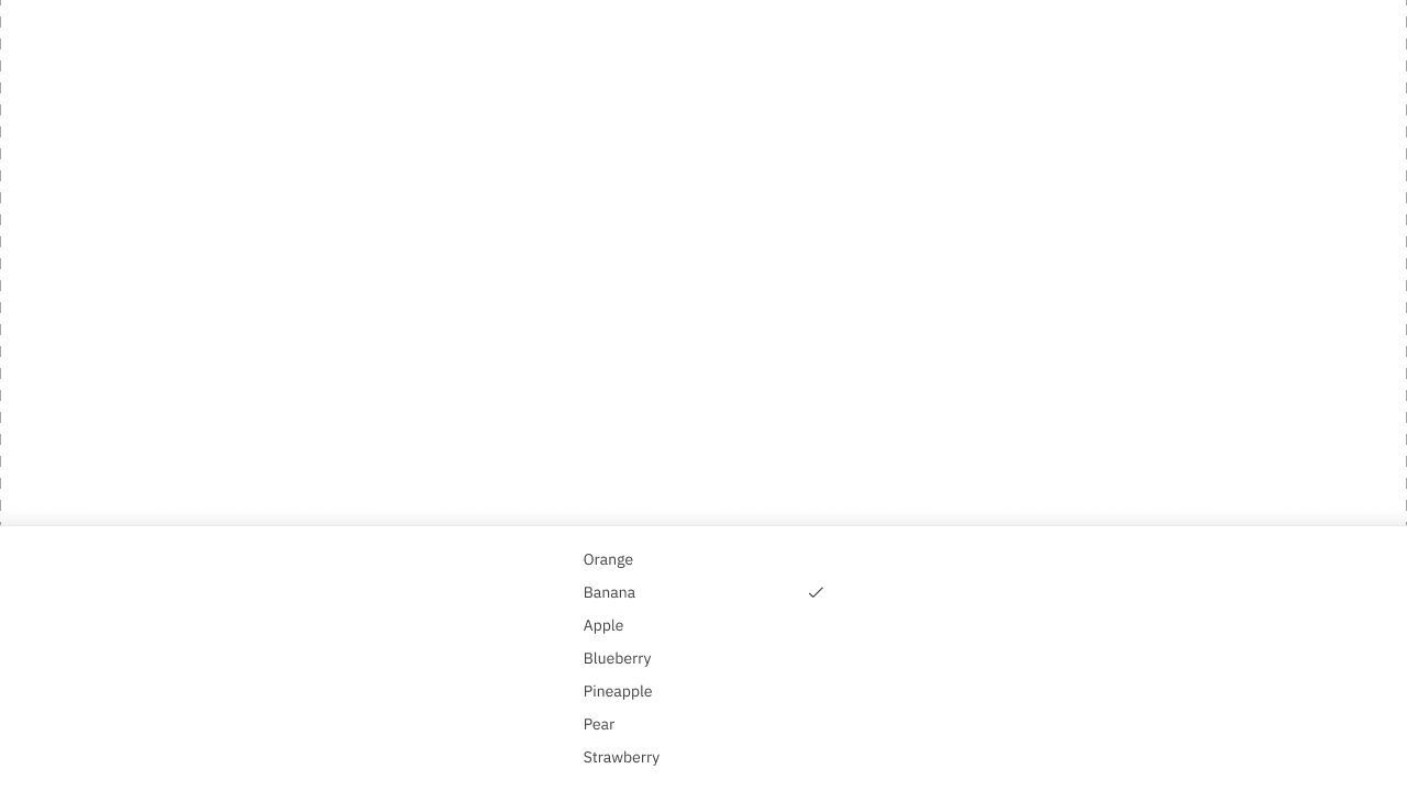
Collection of 4 components.
Dropdown Menus
Displays a menu to the user.
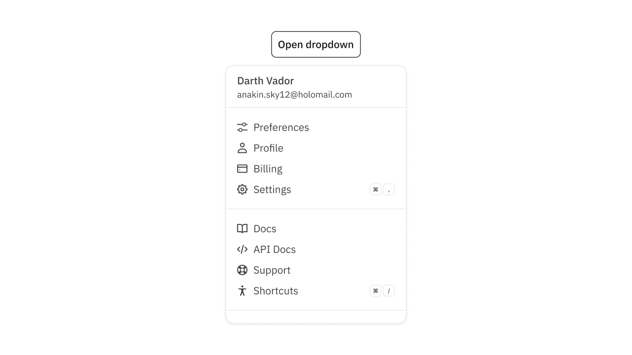
Collection of 6 components.
Editable Title
A title the user can edit on the fly.
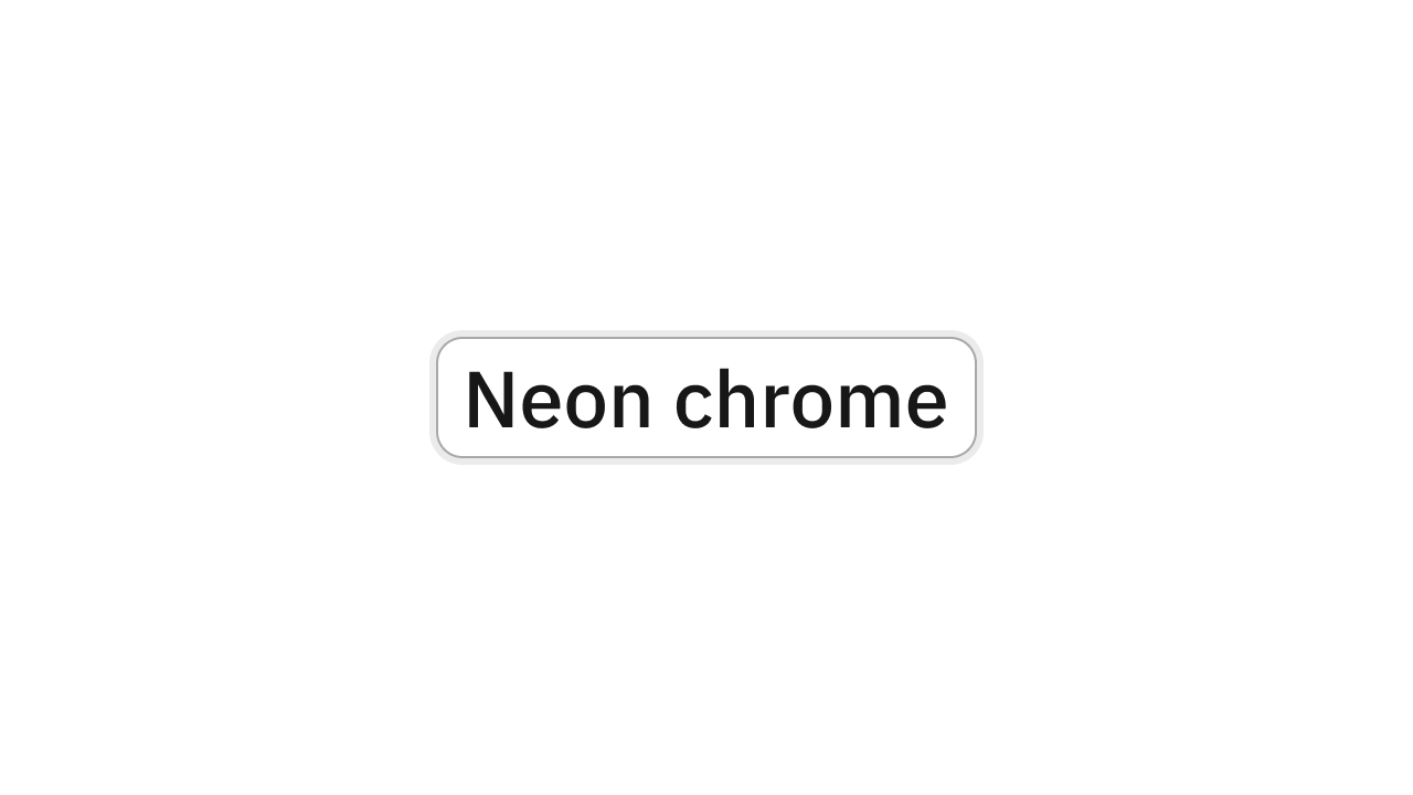
Collection of 1 components.
Empty States
Fill empty spaces to prevent confusion.
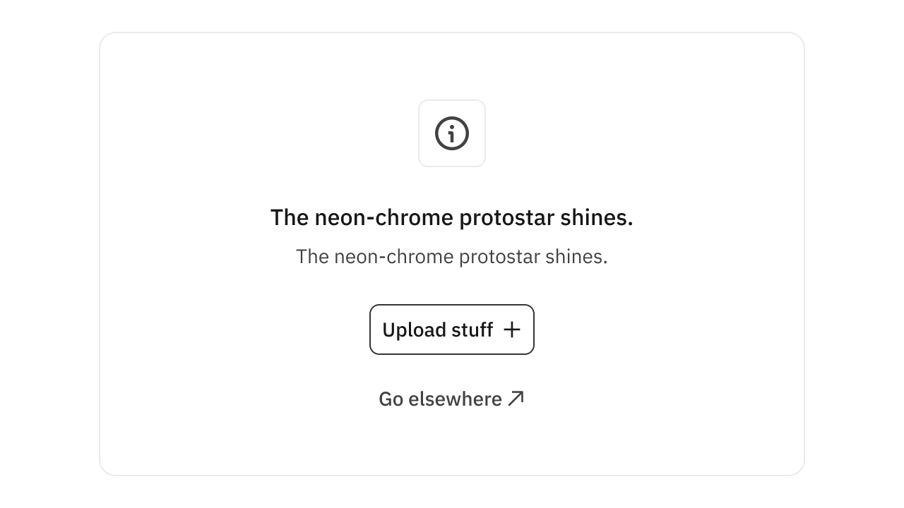
Collection of 2 components.
Feedback
Gather user feedback with an associated emotion.
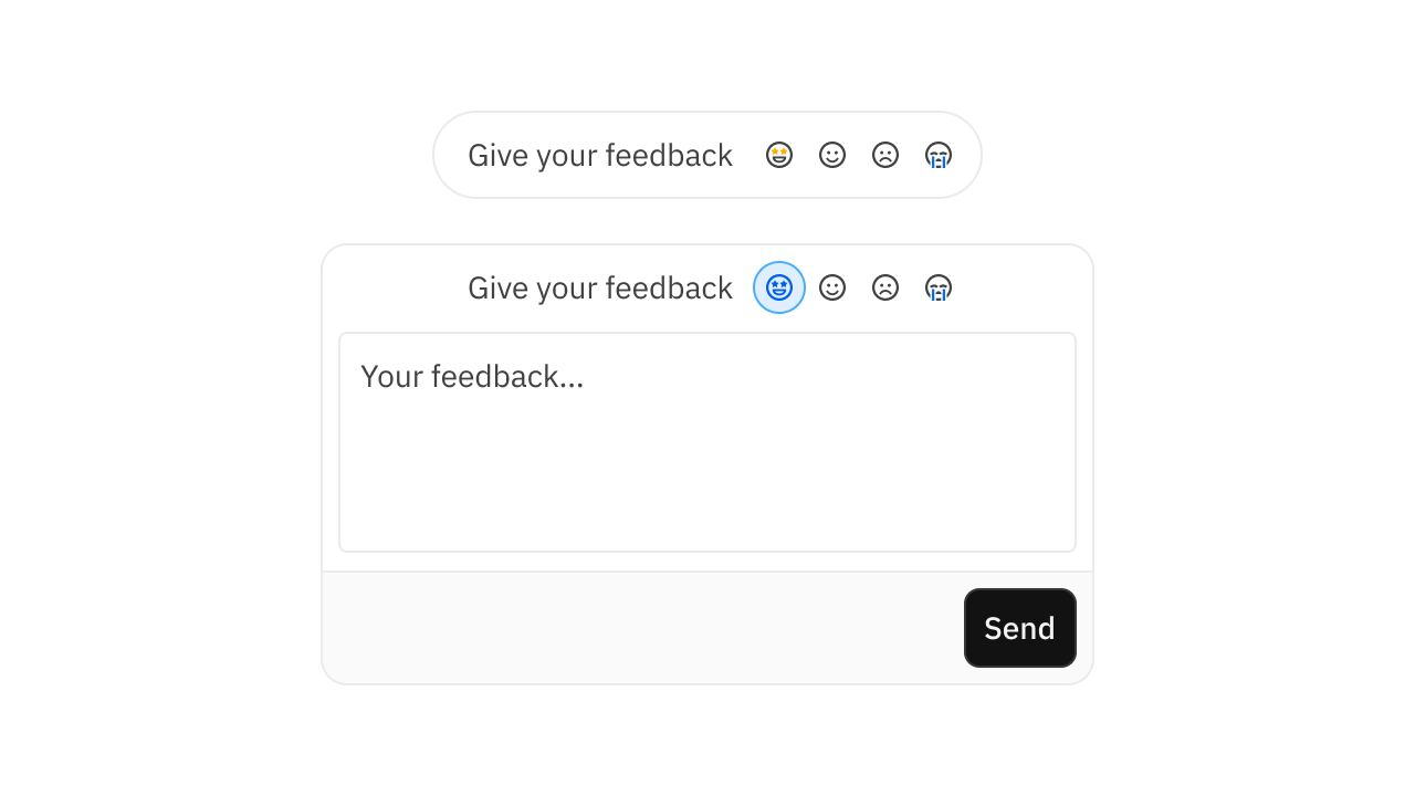
Collection of 7 components.
Form Error
Messages that unblock users and build trust.
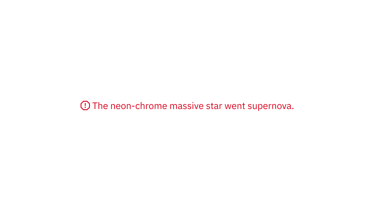
Collection of 1 components.
Form Help
Messages that unblock users and build trust.
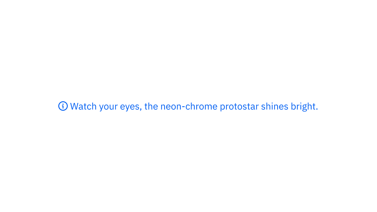
Collection of 1 components.
Form Label
Labels that unblock users and build trust.
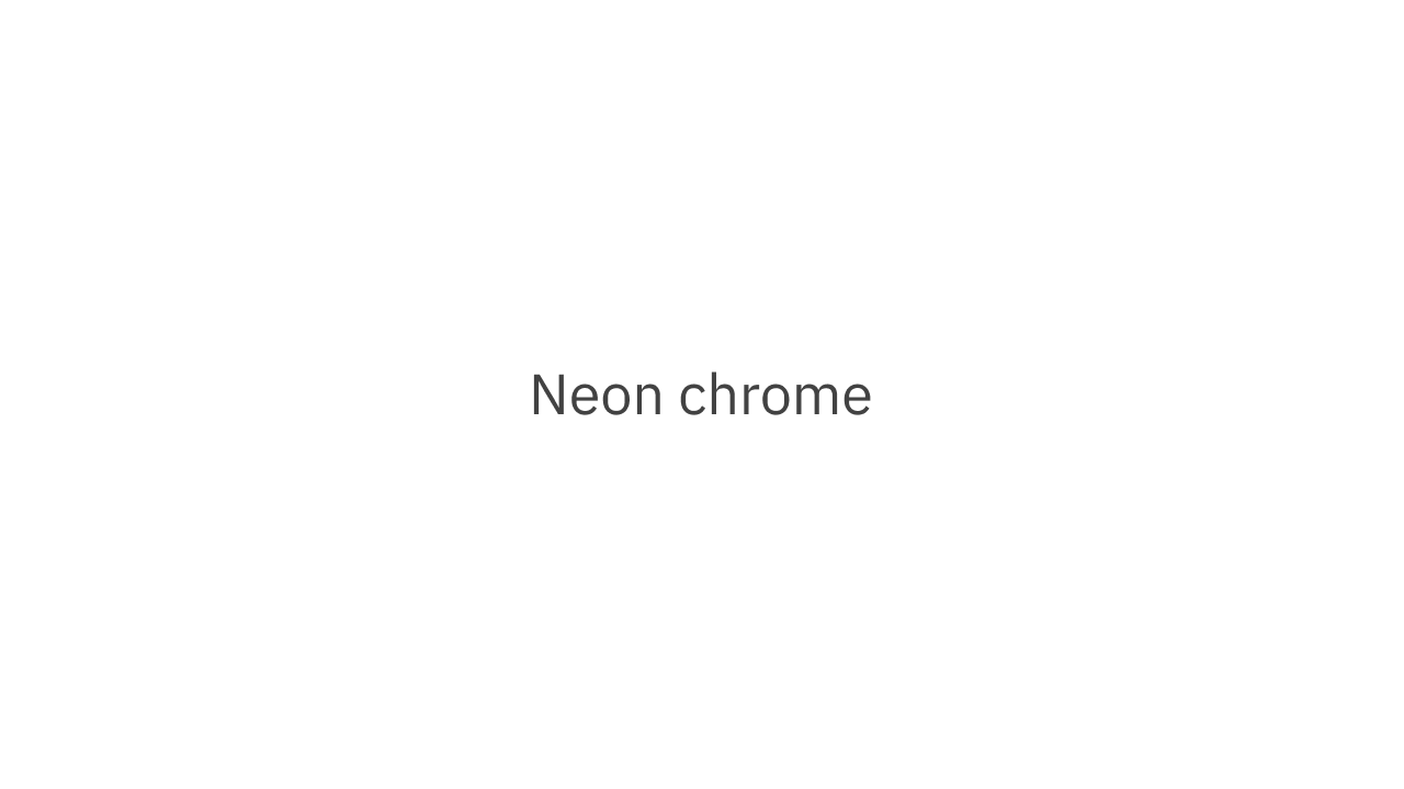
Collection of 1 components.
Gauge
A circular visual for conveying a percentage.
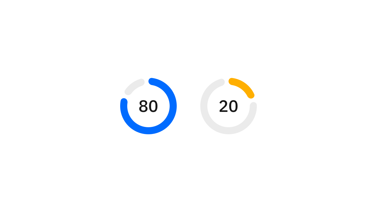
Collection of 2 components.
Input Checkbox
Two states, checked or unchecked.
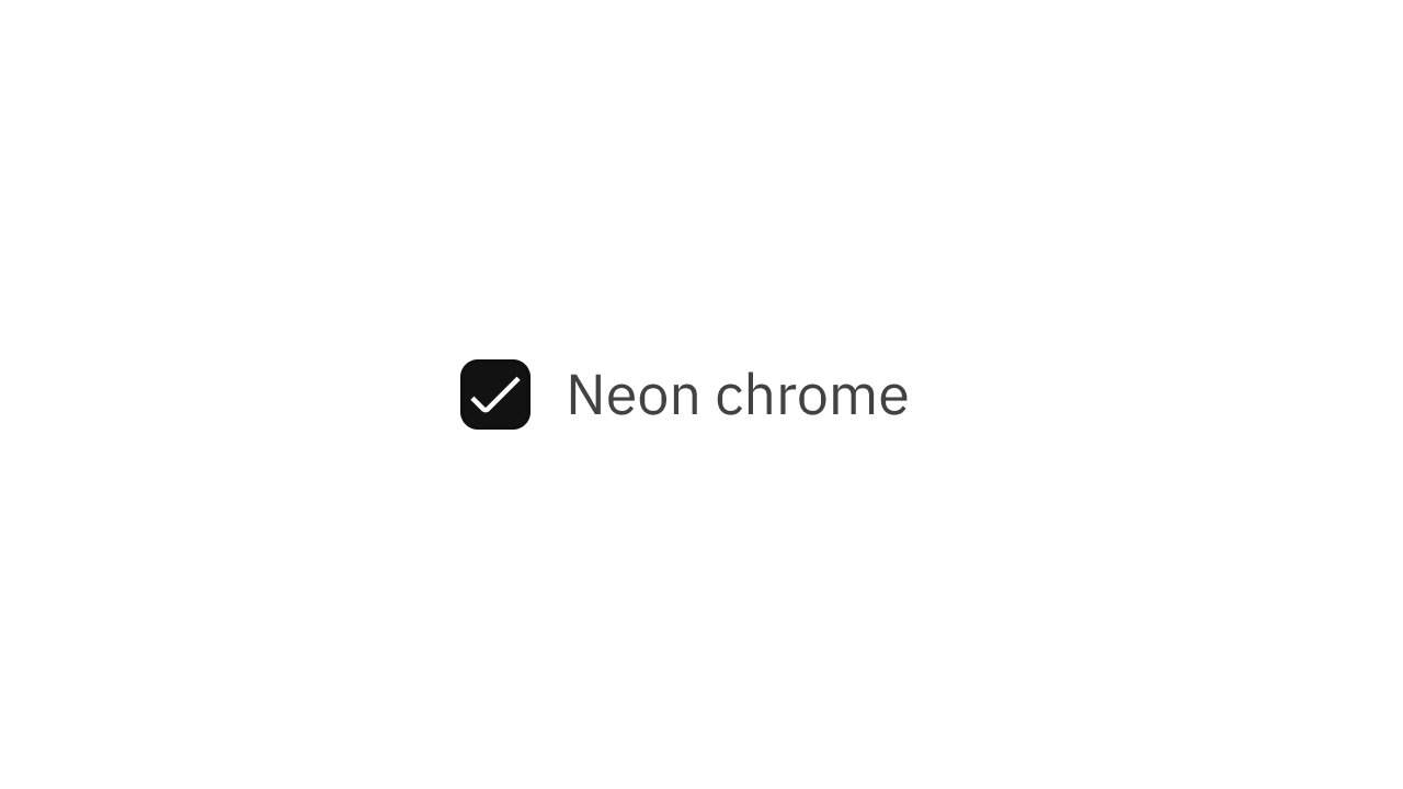
Collection of 2 components.
Input Choicebox
A larger form of radio or checkbox.
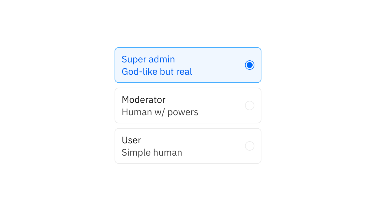
Collection of 2 components.
Input Date
Get a date input from a user.
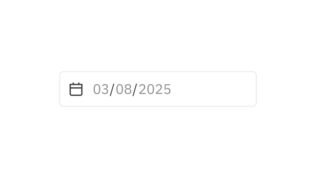
Collection of 1 components.
Input Radio
Single user input from a set of options.
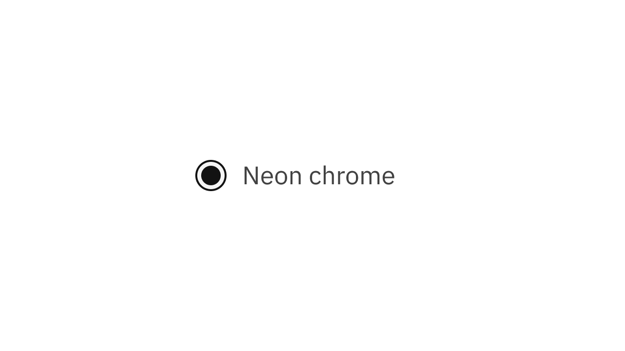
Collection of 2 components.
Input Search
Get a search query input from a user.
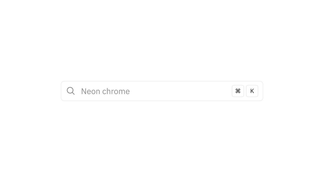
Collection of 1 components.
Input Select
A dropdown list of items to choose from.

Collection of 6 components.
Input Slider
Select a value from a given range.
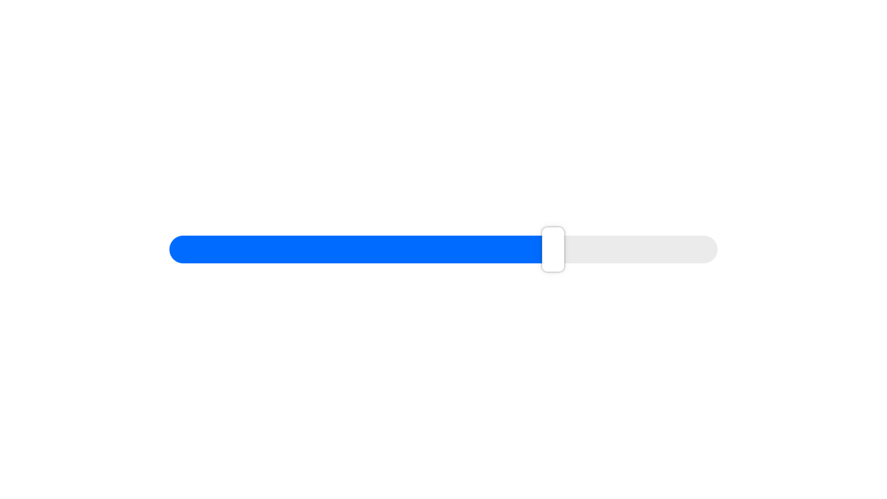
Collection of 1 components.
Input Stepper
Edit a numeric value with buttons.
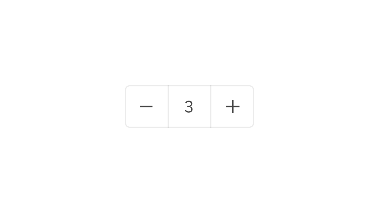
Collection of 3 components.
Input Text
Text input from a user.
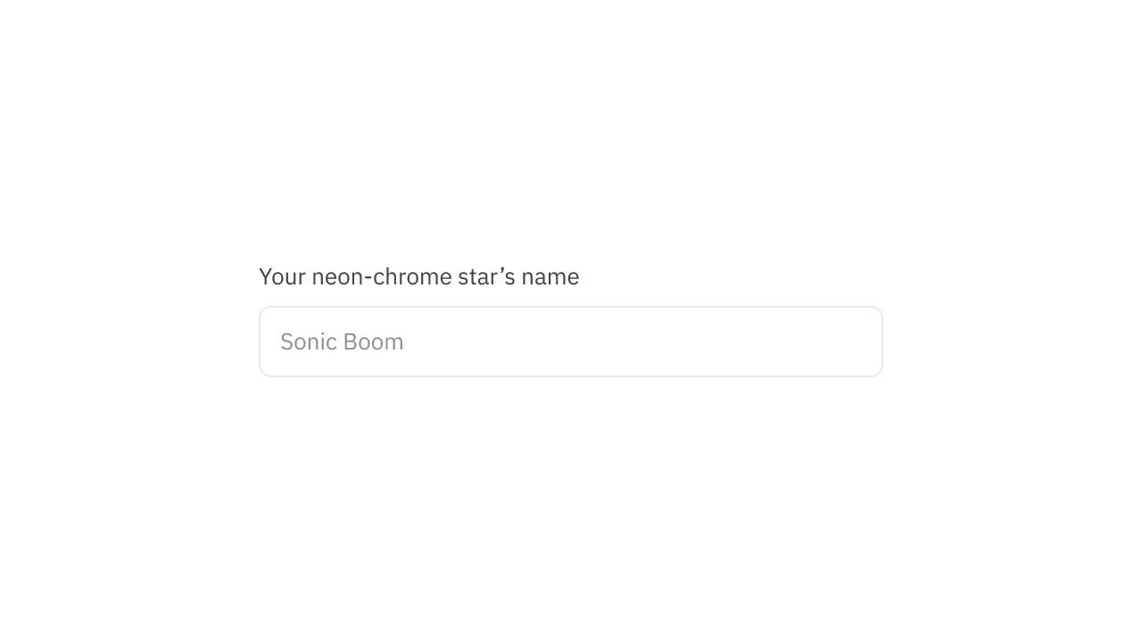
Collection of 2 components.
Input Textarea
Multi-line text input from a user.
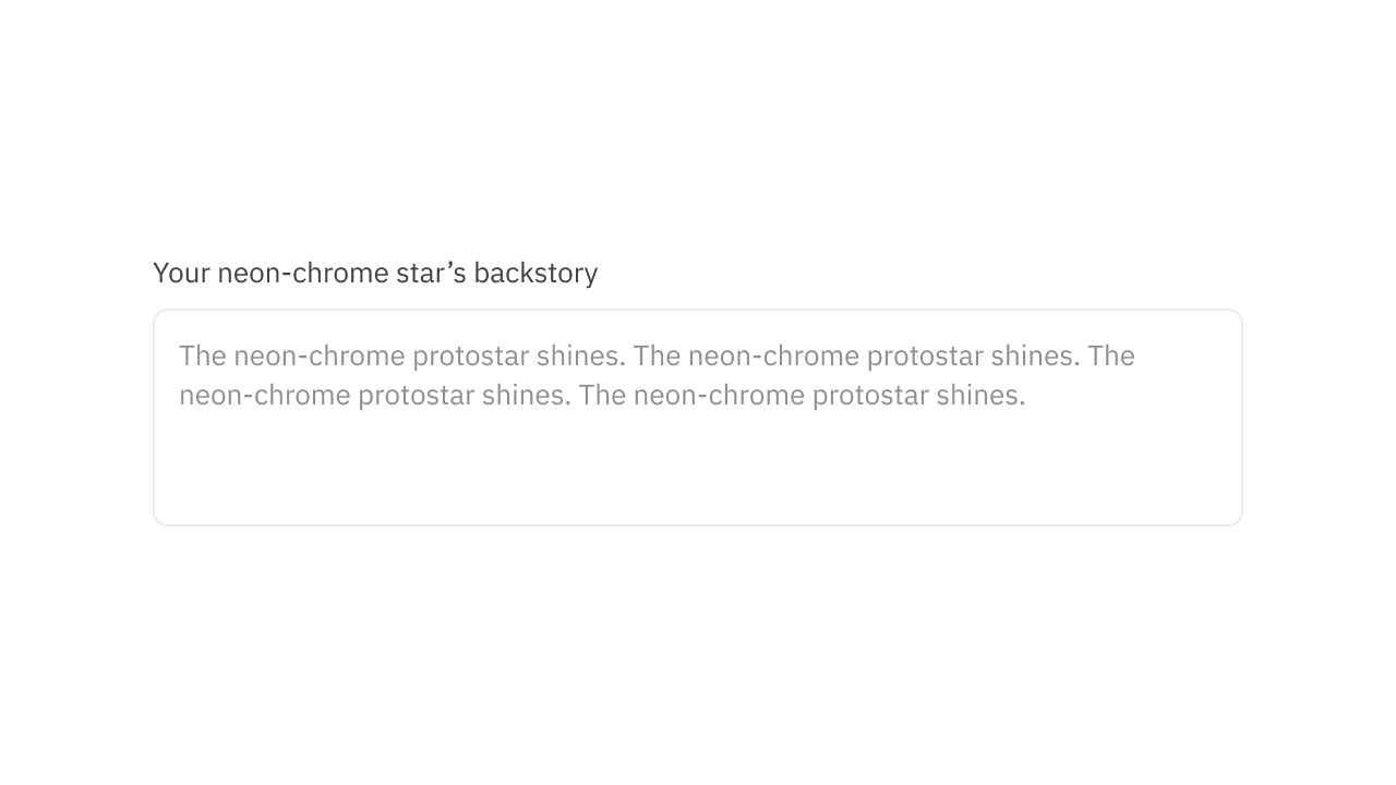
Collection of 2 components.
Input Toggle
Get a boolean value from a user.
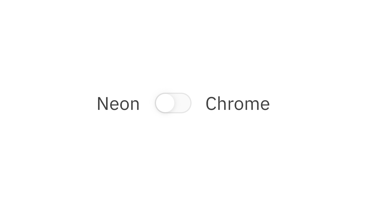
Collection of 2 components.
Input Wysiwyg
Mlti-line rich text input from a user.
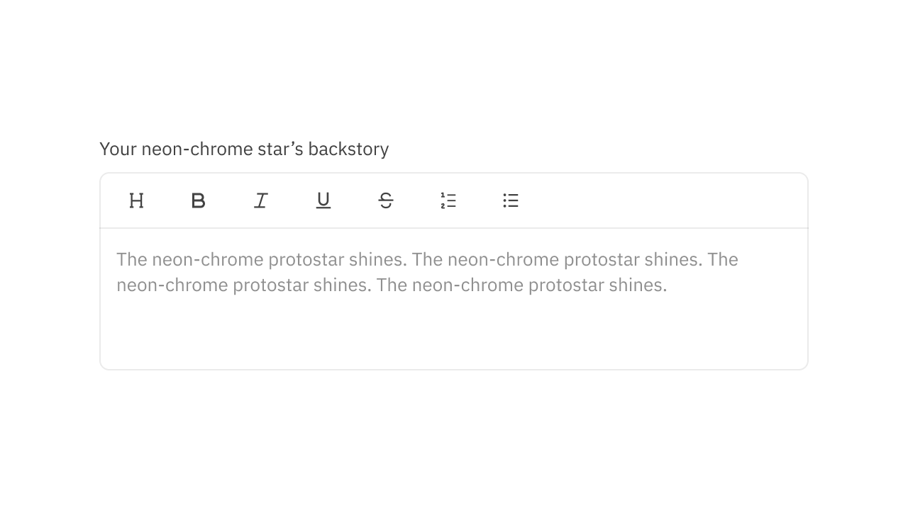
Collection of 2 components.
Keyboard Inputs
Displays keyboard inputs to users.
Collection of 1 components.
Latching Switch
Maintains its state after being clicked.
Collection of 1 components.
Links
Navigate between pages and help users.
Collection of 1 components.
Loading Dots
Indicate an action running in the background.

Collection of 2 components.
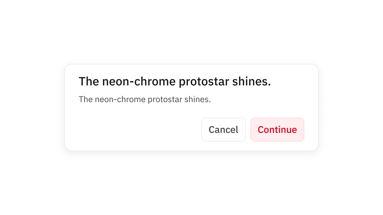
Modals
Window overlaid main UI elements.
Collection of 10 components.
Notes
Grab the user's attention and provide info.
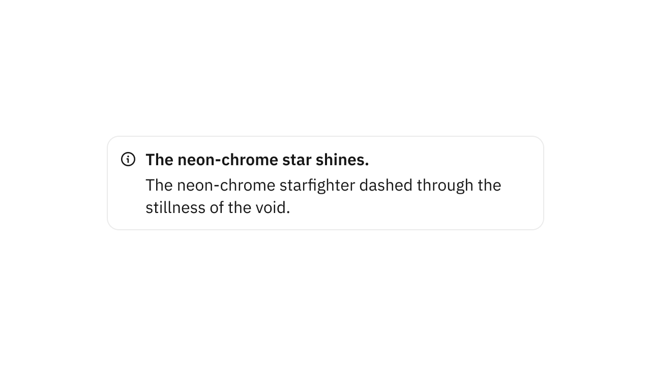
Collection of 1 components.
Pagination
Navigate to the previous or next page.
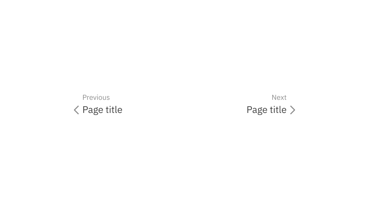
Collection of 2 components.
Popover
Displays content in a portal.
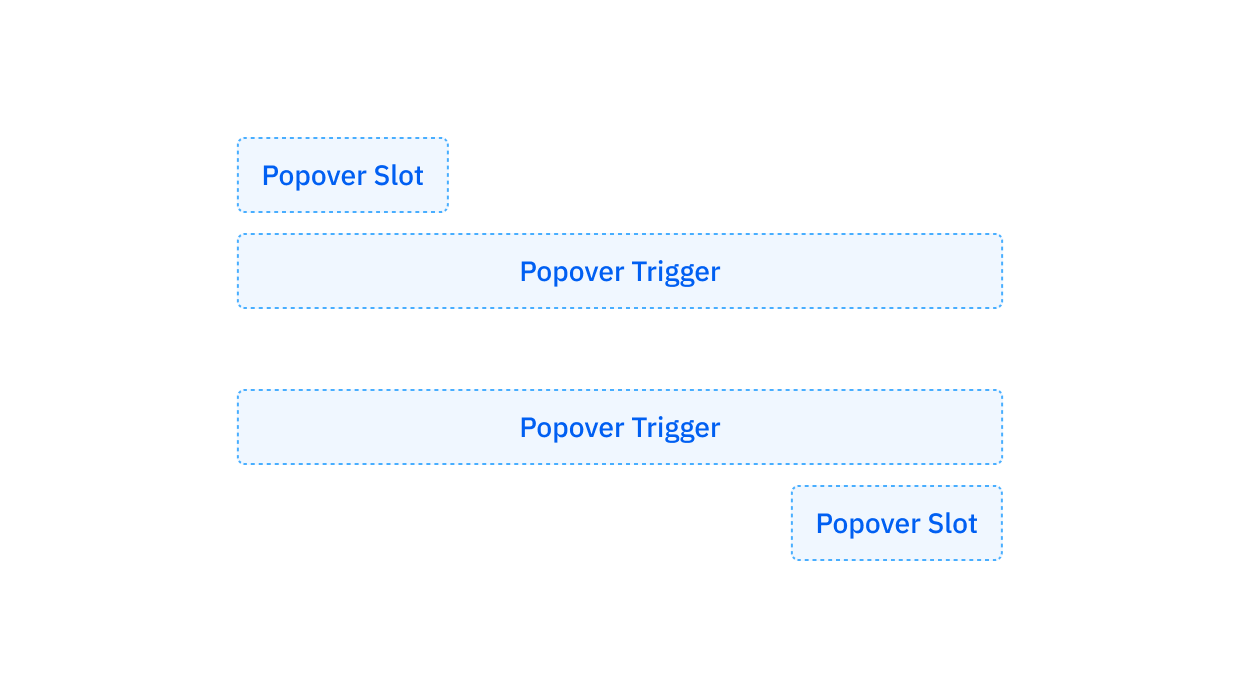
Collection of 2 components.
Pricing Plan
A card representing an offer.
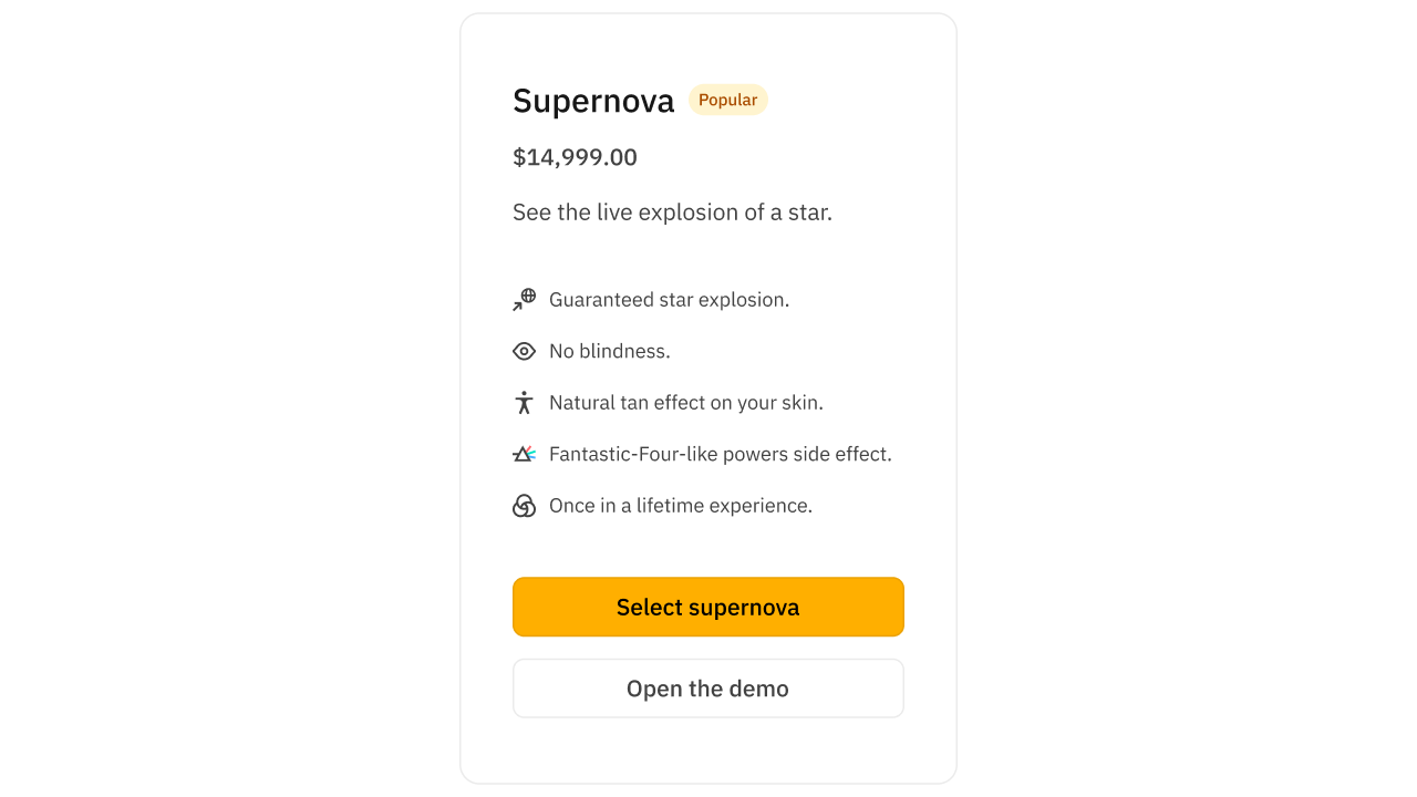
Collection of 9 components.
Progress Bars
Display progress relative to a limit.
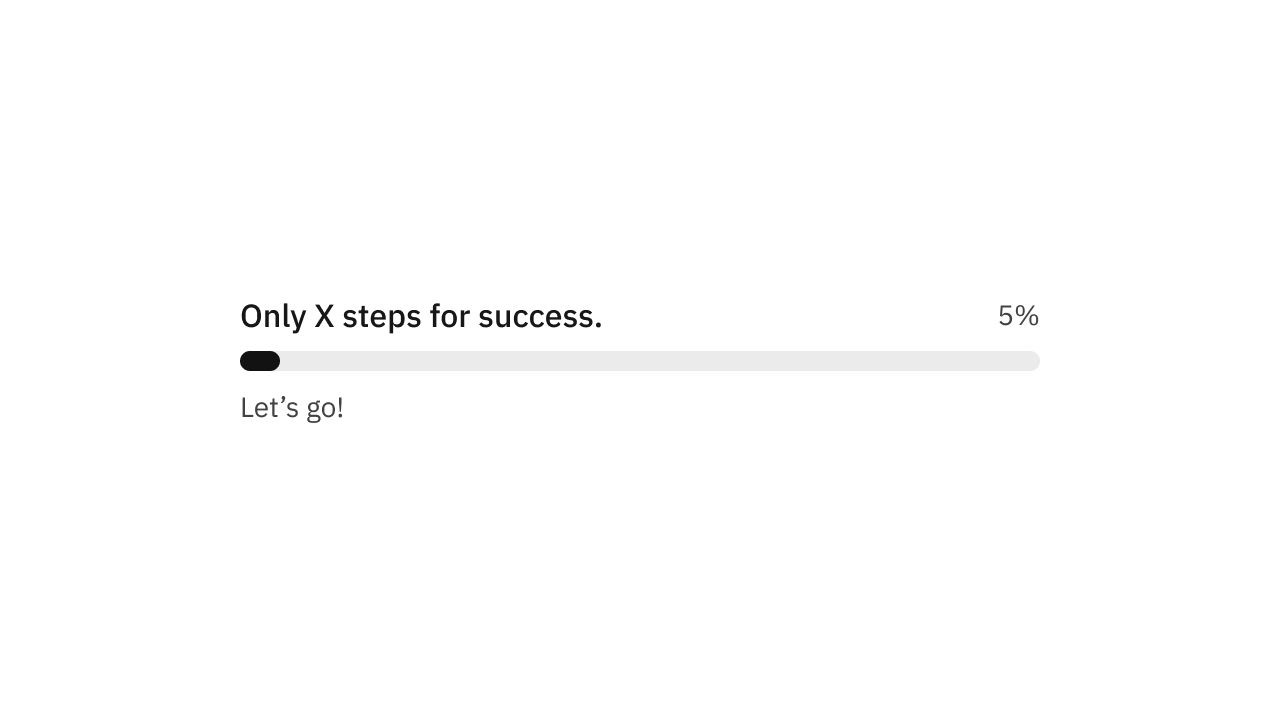
Collection of 2 components.
Responsive Image
Fixed aspect ratio images.
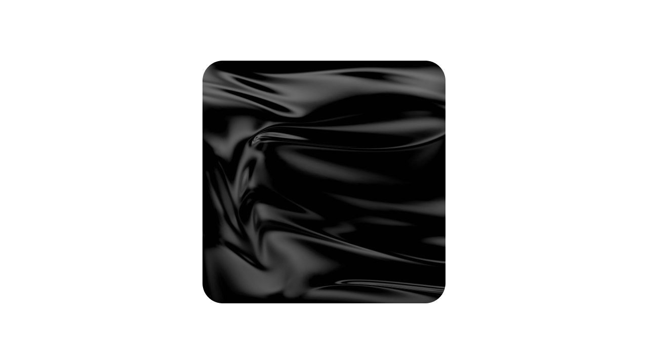
Collection of 1 components.
Responsive Video
Fixed aspect ratio videos.
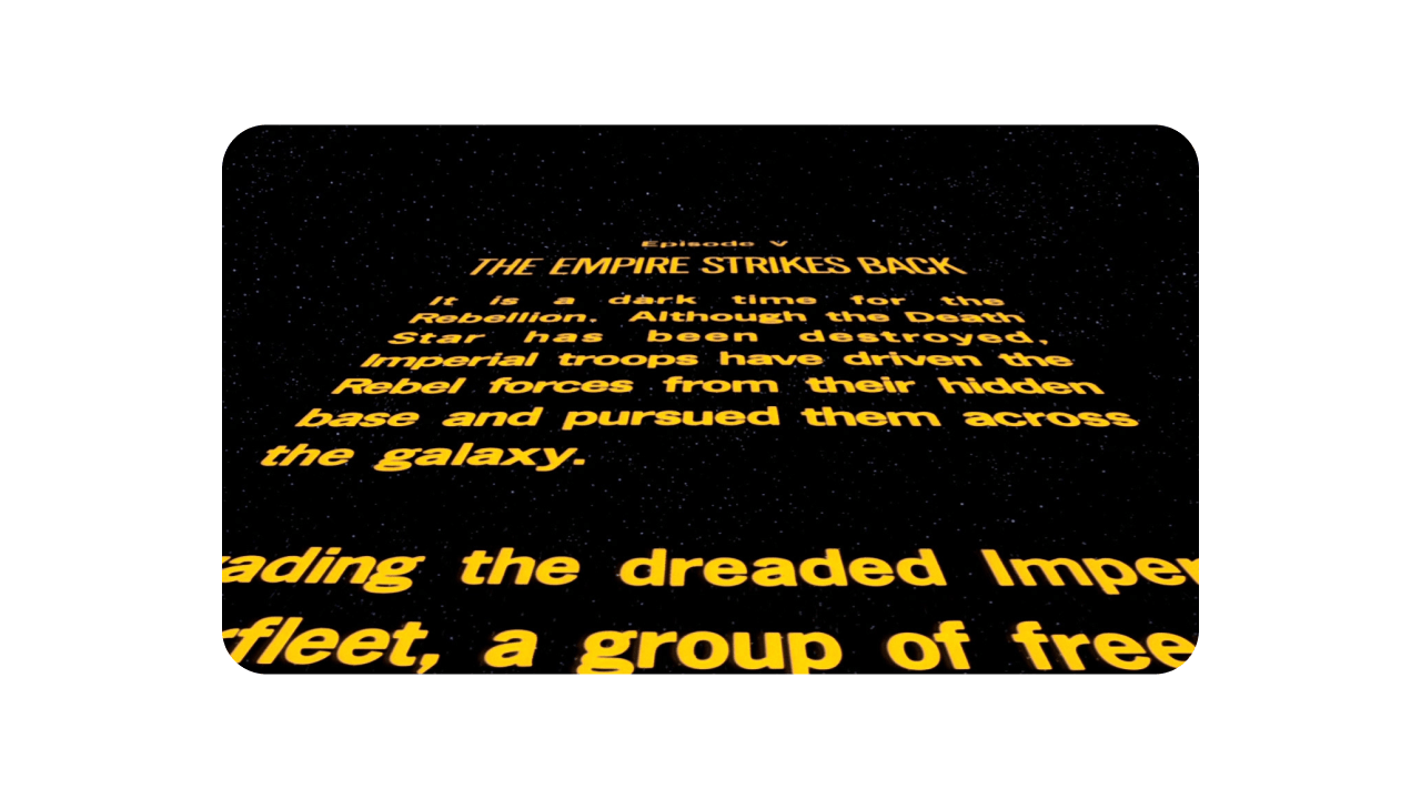
Collection of 1 components.
Segmented Control
Switch between options or views.
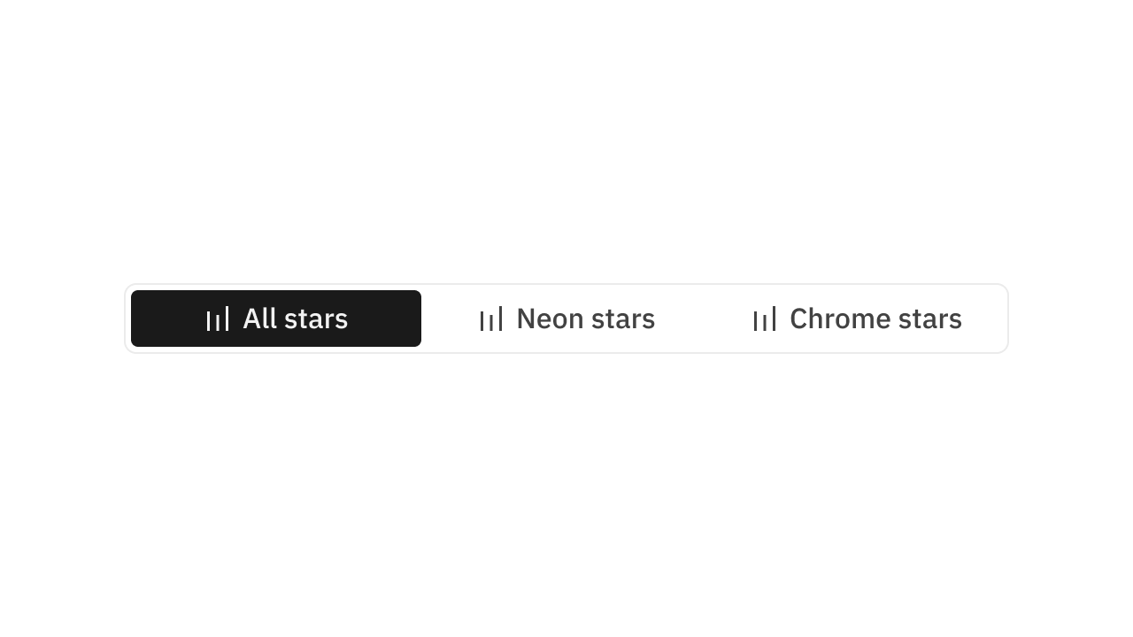
Collection of 2 components.
Sheet
Complements the main content of the screen.
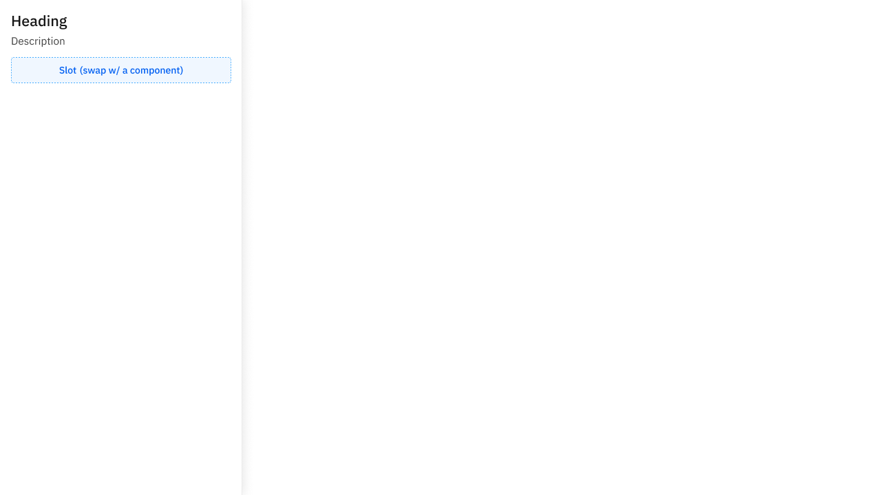
Collection of 4 components.
Show More
Show or hide additional information.

Collection of 2 components.
Side Menu
Links to other parts of your app.
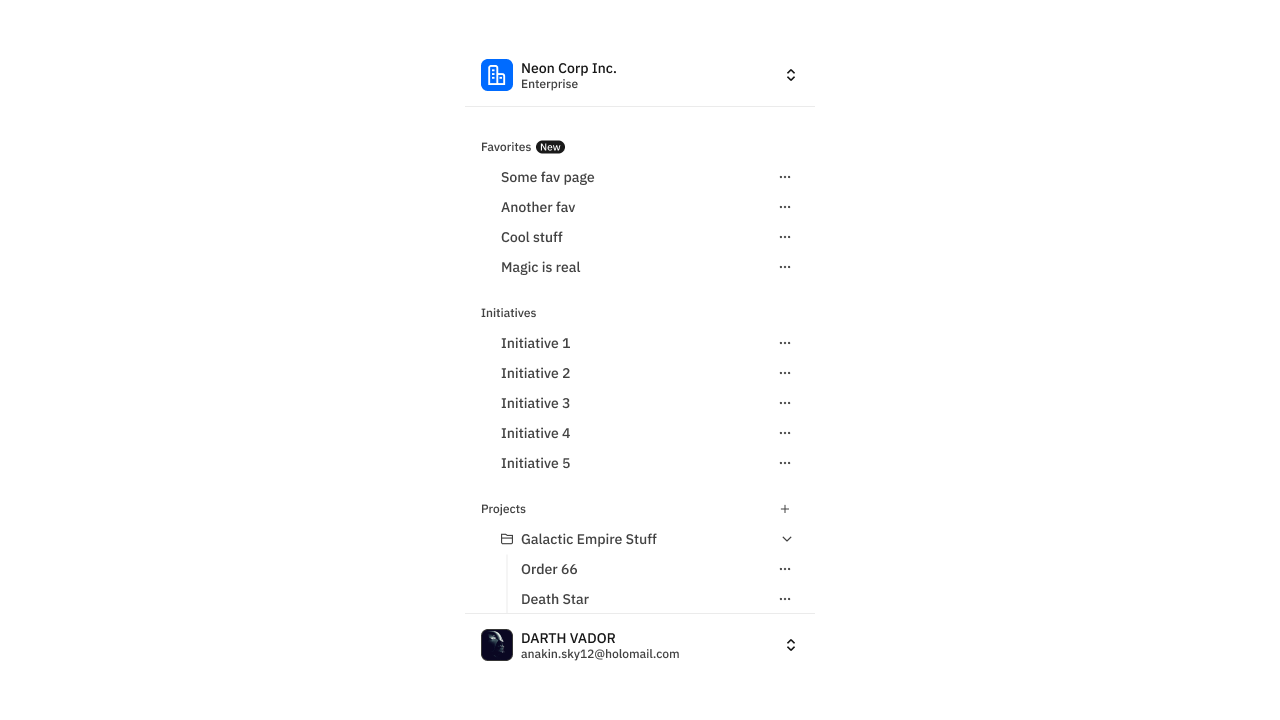
Collection of 12 components.
Sidebar
A container for normal and collapsible navigation links.
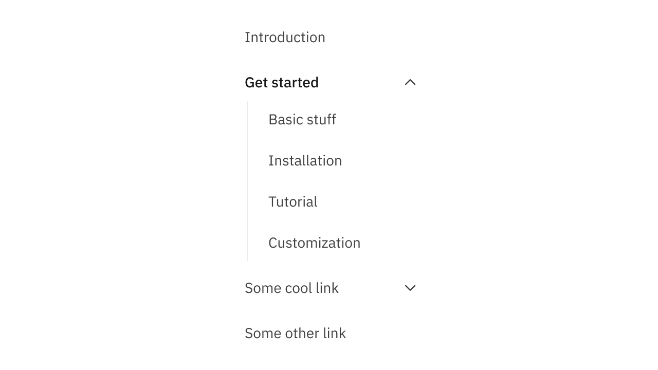
Collection of 6 components.
Skeletons
Displayed while a component is loading.

Collection of 2 components.
Slots
Insert custom content into a component.
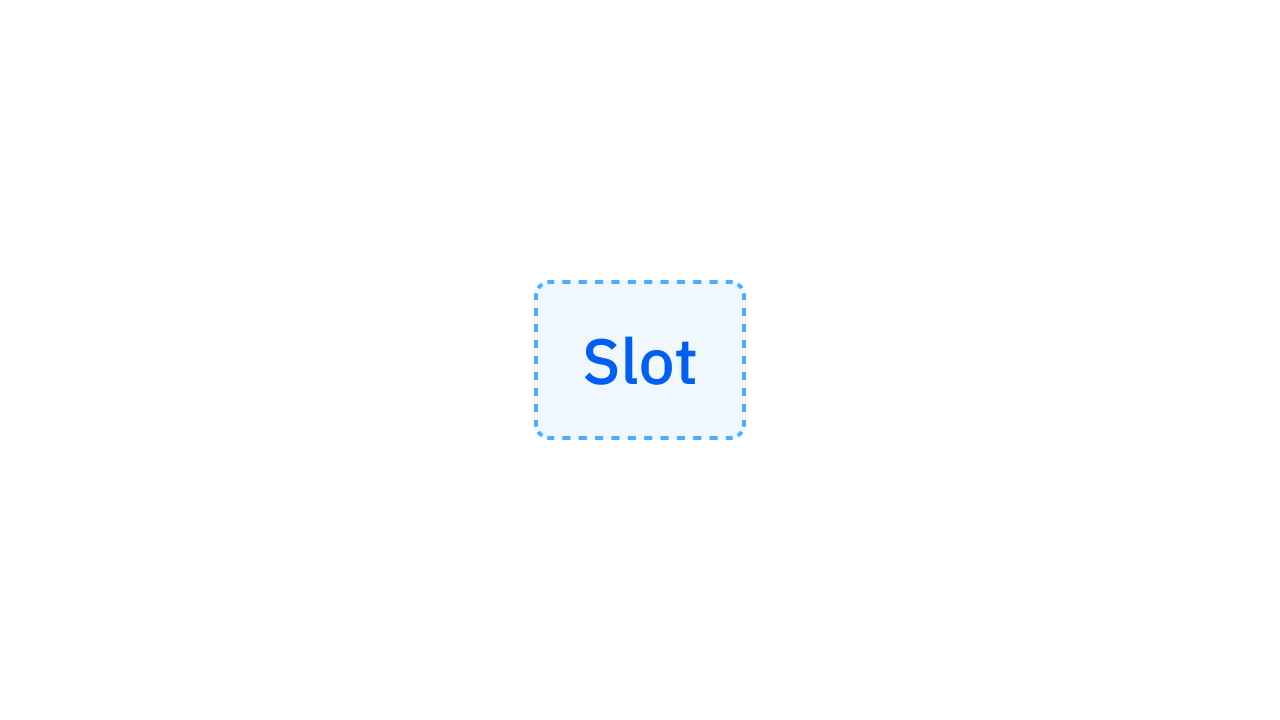
Collection of 1 components.
Steps Bars
Timeline with discrete steps.
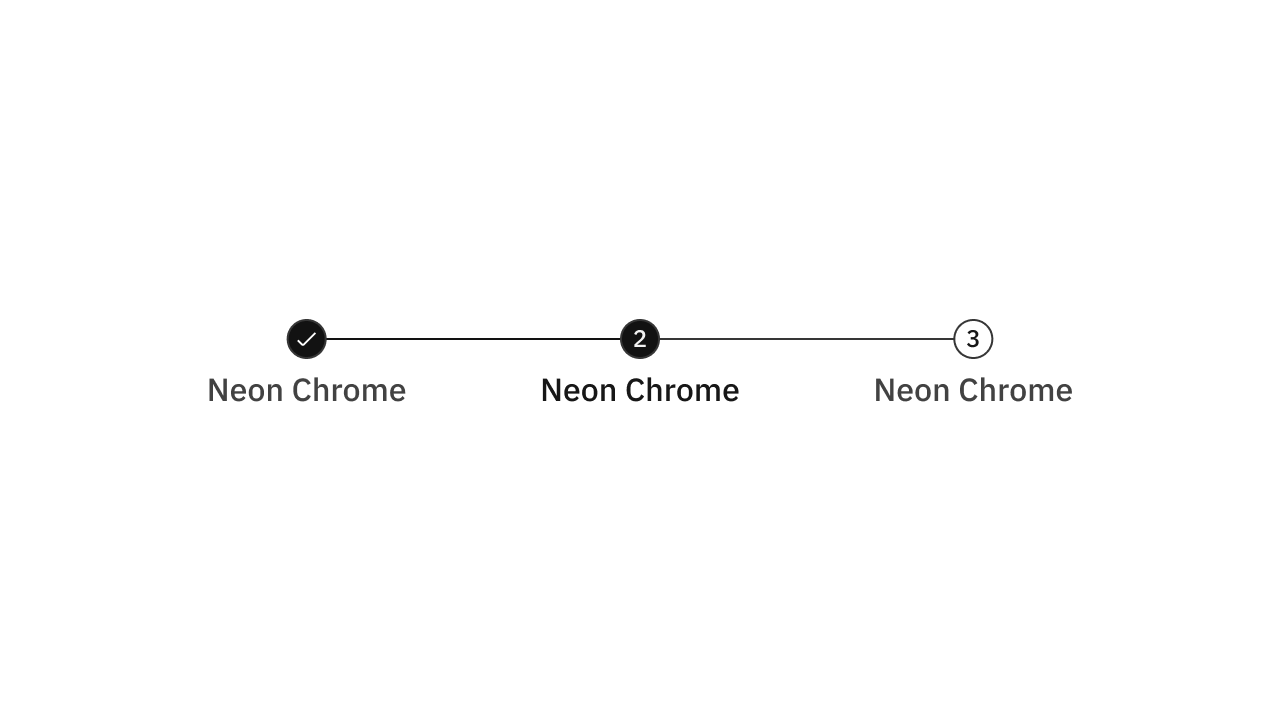
Collection of 2 components.
Tables
Responsive table with zebra rows, etc.
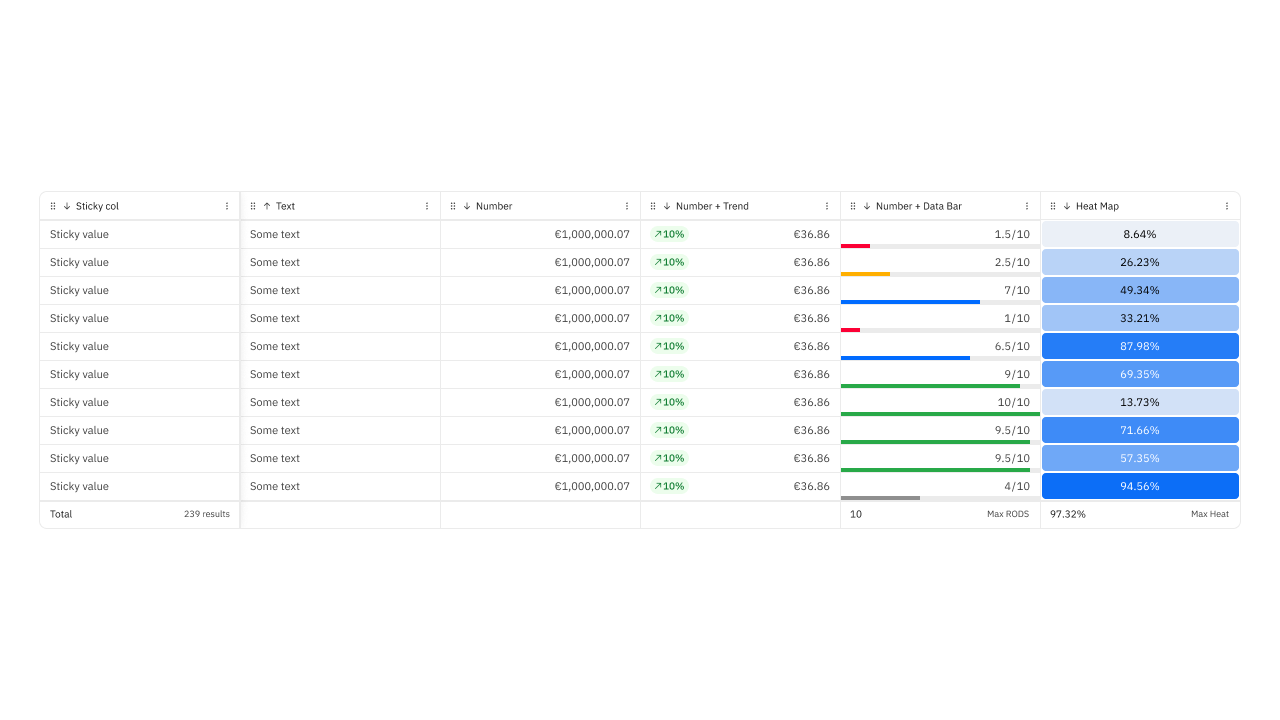
Collection of 9 components.
Tabs
Navigate between panels and pages.
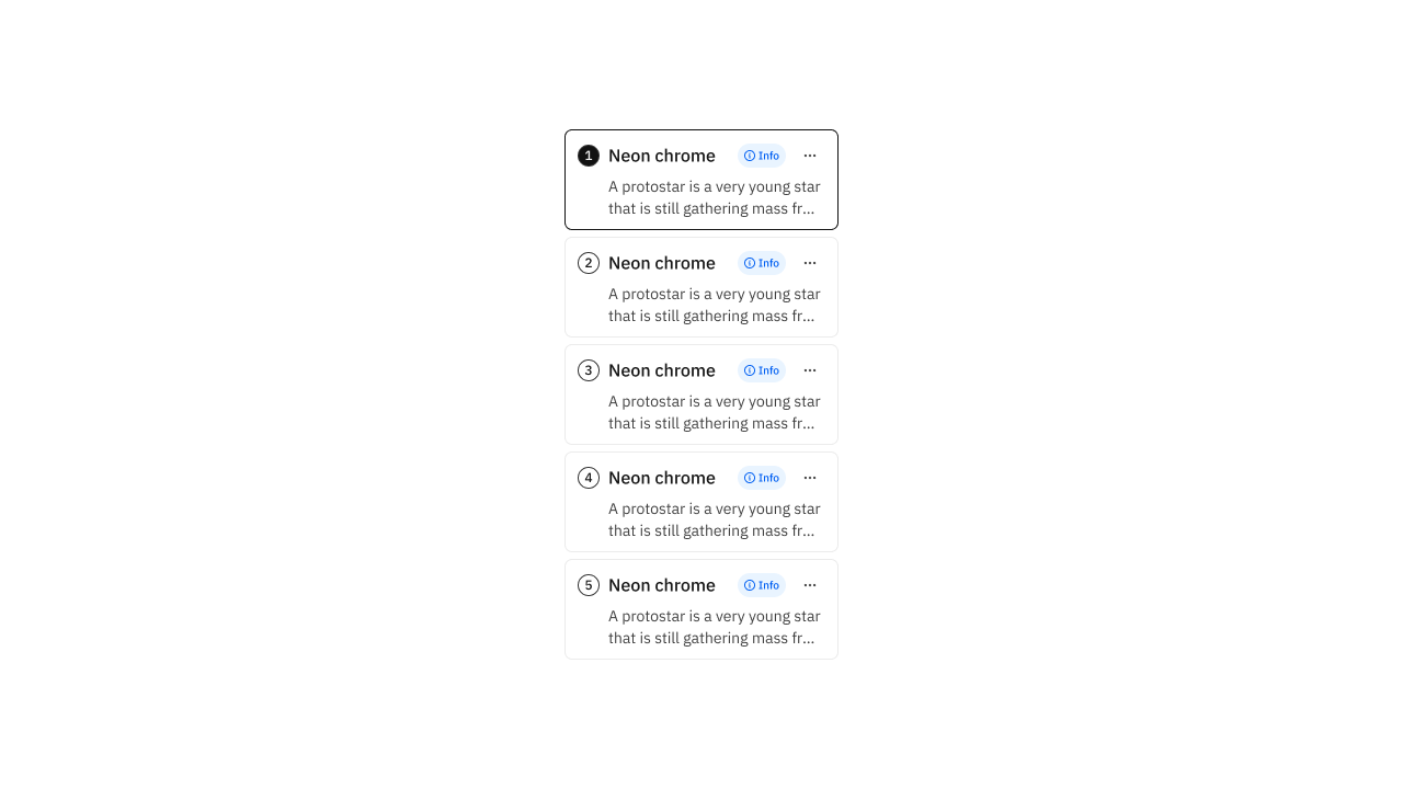
Collection of 4 components.
Texts
Words w/ well-defined typographic styles.
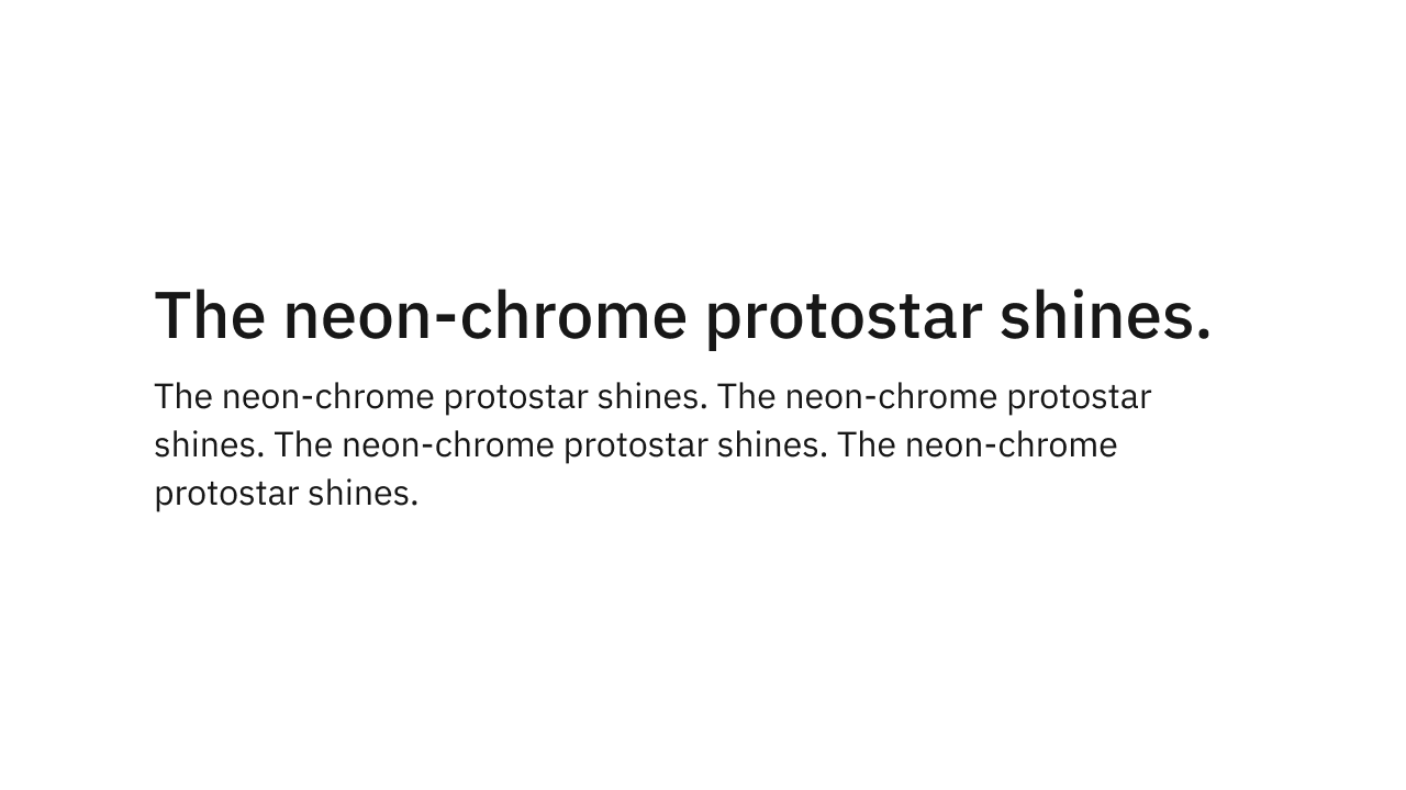
Collection of 2 components.
Theme Switcher
Switch between light and dark themes.
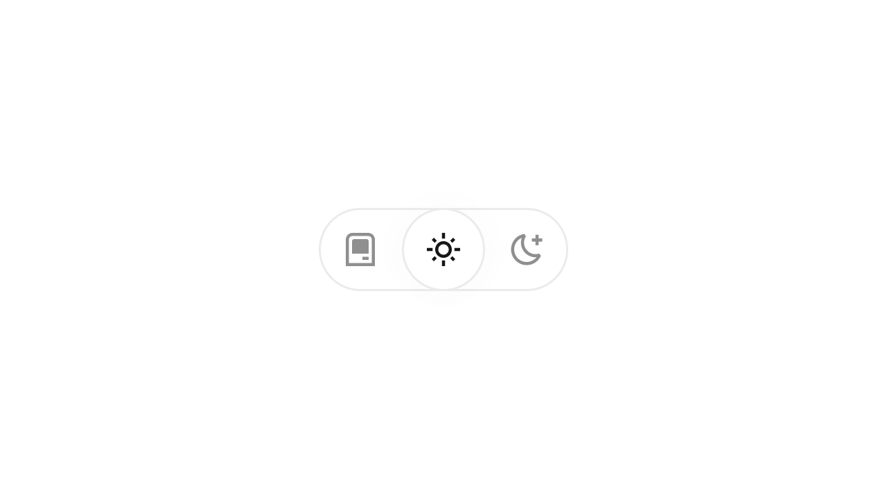
Collection of 2 components.
Toasts
Display concise messages temporarily.
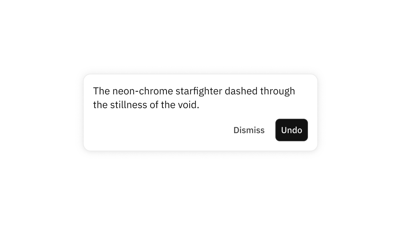
Collection of 1 components.
Tooltips
Popover showing contextual info.
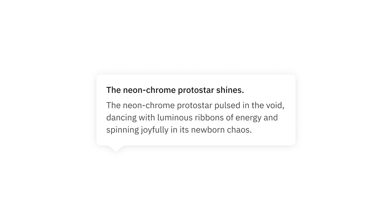
Collection of 9 components.